Brand evolution for the Inner Circle dating app


Updating the familiar
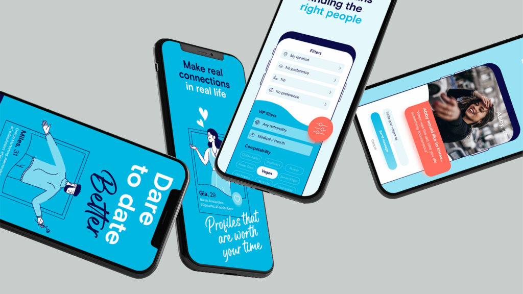
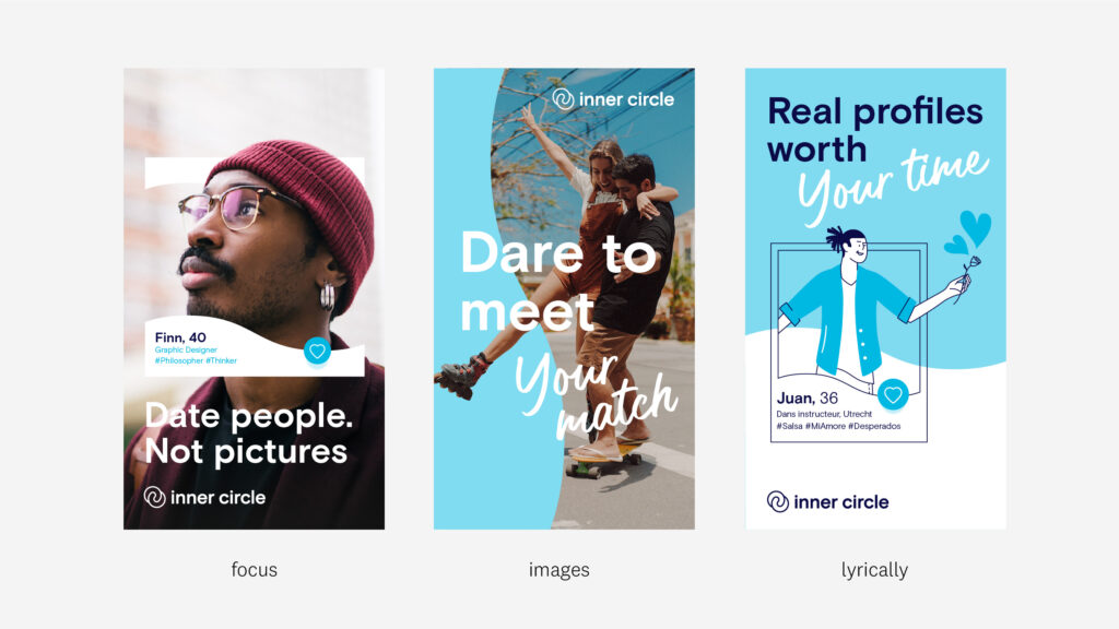
We set to work on the most important components of the identity such as the use of colour, language of form, typography, photography and illustration style, and we also looked for a more applicable design system. We provided a number of draft directions and challenged Inner Circle to choose the right path. We gave them a glimpse of applications such as app store visuals, emails, banners and social media stories.
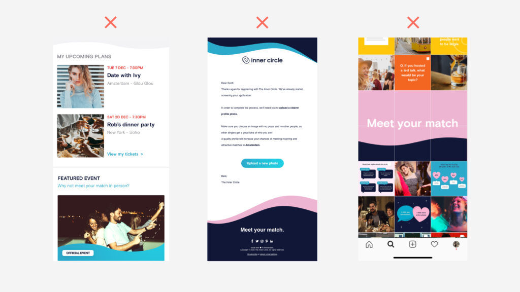
Inner Circle’s original brand identity left room for improvement by making the language of form (wave), use of colour, photography and illustration style consistent.
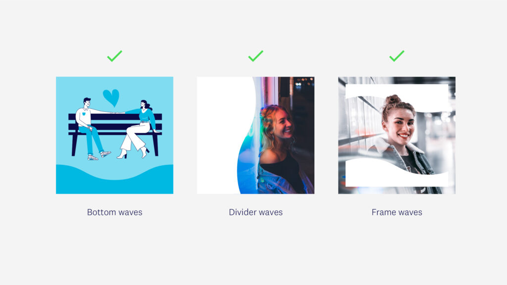
A new design system with recognisable elements and options for different applications.
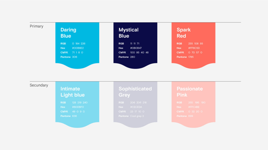
… a fresh new colour palette with greater use of ‘Daring Blue’…
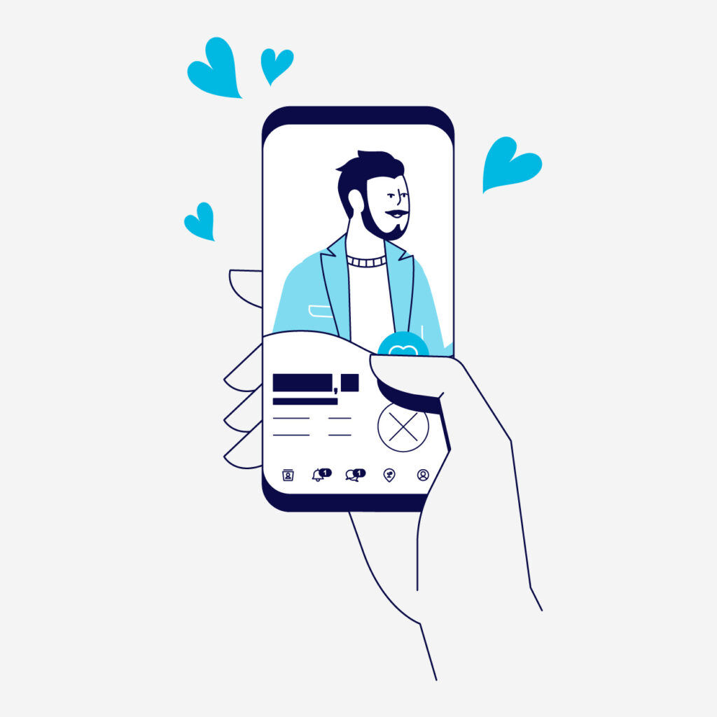
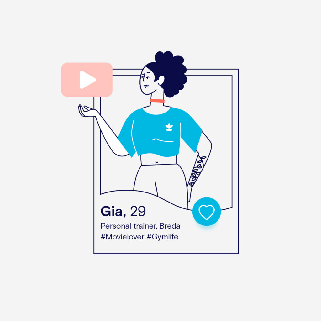
… with a recognisable, updated brand identity as the result